
Google [MAY '16 – CURRENT]
Staff UX Engineer
Previously: Senior UX Engineer
Previously: UX Engineer, Design
Clipboard Preview with cross device support: Identified opportunity, ran foundational research, designed, prototyped, tested and lead several teams to ship new UX
Left: Android P rotation lock: Owned the vision, prototypes, design and code
Right: Android P volume control: Owned early designs, prototying, interaction details
Android P Sandbox Google I/O ‘18 Lead: Owned demo reel, lead press walkthrough and more
Fast Pair: Owned the vision, prototypes, design and BLE signal normalization
Dismiss on Android Auto: Design exploration, prototyping and idea seeding for capacitive, resistive & rotary headunits
Overview
What is a UX Engineer? See UX Engineering at Google. Similar titles are Design Technologist, Prototype Engineer, Design Engineer, Prototyper and Creative Engineer.
Many of my public Android Open Source Project (AOSP) commits are viewable on googlesource.com.
Public projects
- Clipboard Preview with cross device support: identified opportunity, ran foundational research, designed, prototyped, tested and lead several teams to ship new UX
- Toast redesign lead: as a side project, brought polish to the Toast notification UI which was untouched for nearly a decade
- Conversations, sharing shortcuts lead: surfaced potential, designed for the future, created APIs, shipped on many surfaces, validated what worked, pivoted the team, coordinated to ship
- System sharing menu lead, user friendly & faster: Google I/O ‘19 presenter, evaluated problems with prototypes and user research, constrained solutions with near-prod prototypes, rebuilt icon generation, orchestrated a team of 13 to ship in Android Q, revamped documentation, lobbied OEMs for ecosystem consistency
- Dynamic screen rotation lock lead, turn+confirm to rotate: owned the idea and vision, gathered prior research, built 5 distinct solutions and take-home prototypes, sold the need, formed a team, owned the interaction+visual+motion design and final production code to ship in Android P, launched as default on
- Fast Pair lead, easy headphone pairing via BLE: owned the vision, hw+sw prototypes, interaction+visual design, coordinated with 2 teams on implementation, mfgr protocol and UI polish, available on most Android devices
- Wifi sharing lead, QR code to share home wifi: developed & pitched idea, gathered relevant data and analyzed market, prototyped 4 multi-ecosystem solutions, consulted on final design and eng for launch in Android Q
- Gestural navigation parameter lead: built tool to collect detailed touch data, worked with research to collect natural user gestures, derived gesture params for new system navigation via stats, launched with nav in Android Q
- Ergonomic, media default volume controls: identified pain points, developed early solutions to sell the need for change, iterated on the UX with working group, created robust and fully functional take home prototypes, bridged complex design and eng decisions across 4 teams, launched in Android P
- Dismiss gesture lead on capacitive, resistive & rotary headunits: lead design exploration and prototyping, created solutions and UI architecture needed to launch home card dismiss for all Android Auto Projected surfaces
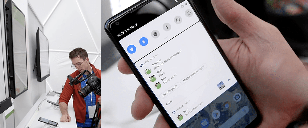
- Android P Sandbox Google I/O ‘18 lead: created and scripted demo reel to demo Android P features, built notification demo app for press, lead press walk-through, trained other sandbox staff
Core responsibilities
Broad strategic scope through project validation and core contribution
- Validated and invalidated core assumptions for several high priority, strategic projects
- Owned outcomes as a core contributor of Sharesheet, Nearby, Conversations, Toasts and Clipboard Preview and more. Lead teams through pivots based on core assumptions changes to land launches.
Entrepreneurship, strategic impact and persuasion
- Track record of strategically creating or picking and focusing on problems that have paved the way for projects critical to Android’s growth and Pixel’s market competitiveness
- Like Nearby Share as an underpinning for larger projects, UI and APIs critical for sharing and people, analytic understanding of core behaviors like copy and paste, interactions with 3ps and OEMs for adoption
- Lead the search for several new solutions to open-ended, ambiguous design problems at the core of sharing and conversations, and basic OS primitives like copying and pasting. Sometimes resulting in failure which is equally valuable.
- Addressed high complexity escalations as they arose from internal challenges and OEM push-back
Prototyping, Android UI expertise
- Developed and directed several large front-end projects like total redesigns of the Sharesheet, Clipboard Preview and Conversation related interfaces. Leveraged prototypes to prove engineering feasibility by existence proof.
- “Go-to” person for deeply complex Android UI engineering with domain knowledge and first point of contact for several components of the OS UI because of historical context
Team lead
- Guided contributions of the broadening UX and engineering teams by serving as a formal mentor while helping convey critical knowledge about Android operations as a whole through on-boarding efforts.
Other responsibilities
- Front-end eng: custom views, touch processing and research validation, complex layouts, smooth motion
- ML: human interfaces for machine learning, probabilistic algorithms and heuristics
- Enabling prototyping: tool dev, researching hacks+exploits, reverse engineering, OS modification
- Tech stacks: my work has used embedded software, hardware, BLE advertising + GATT servers, wifi direct, mDNS, Bluetooth A2DP & HFP profiles, orientation sensor and heuristics, sensor hub
Clipboard Preview with cross device support in Android 13
Identified opportunity, ran foundational research
- Identified cross device copy & paste as most feasible from a number of potential projects as most critical for strategic success of Nearby Share
- Uncovered complete lack of research on the toothbrush journey of copy and paste
- Partnered with research to gain foundational knowledge by performing first-of-its-kind longitudinal quantitative study on copy paste with prototypes I built
- Designed and implemented custom data analysis prototype pipeline could show the full journey users taken between copy and paste
- Performed data analysis on longitudinal study to gain a clear, quantitative understanding of copy and paste behaviors
Designed, prototyped, tested and lead several teams to ship new UX
- Leveraged results to iterate on design, integrate cross device functionality and create a fully-functional Clipboard preview prototype
- Proposed and validated core design assumptions through second longitudinal study with updated prototype and data analytics that improved on Android’s core copy experience
- Lead UX and engineering teams to ship UX across Android System UI, Nearby Share
Highlights
- MKBHD’s Top 5 Android 13 features
“I’ve gone through the liberty of picking my top 5, best Android 13 features. I’m going to start at number 5 which is the clipboard…. When you copy text, the phone will now give you a preview with the option to tap on that box and then edit the text in the clipboard. And then if you copy an image, it’ll automatically take you straight into Markup so you can write on it, or crop it or save it.”
- Google I/O keynote showing the new Clipboard Preview and cross device sending
- Updated general clipboard documentation
- Android 13 Clipboard behavior changes documentation
- Related patent
Toasts redesign in Android 12
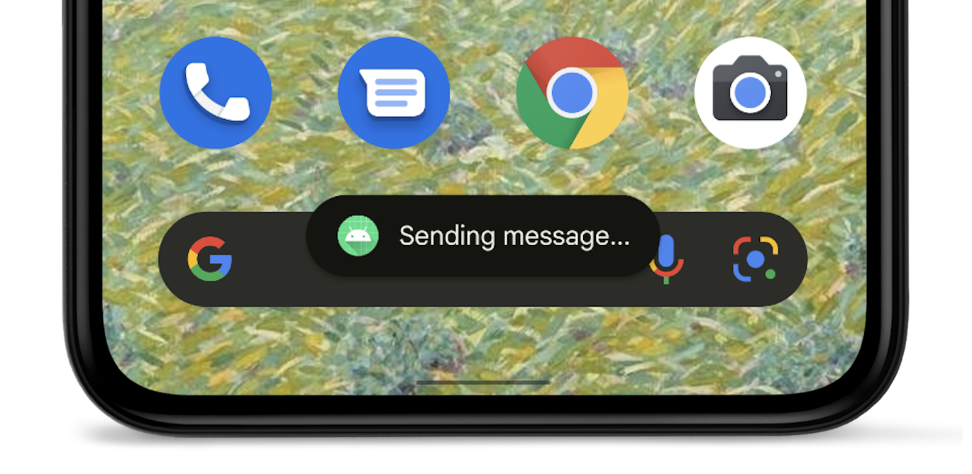
Lead Toast notification UI changes as a side project: designed, protected, shipped
- Identified design challenges with the wild-west, unconstrained use of the Toast notification UI by apps
- Proposed new designs to ensure Toasts were useful and understandable by users
- Toasts were limited in line length to ensure they could be read before being dismissed by the majority of users
- App icons were added to Toasts pushed by apps in the background so users could understand the source, these Toasts could not have their UI changed
- Ensured design changes would propagate across OEM devices by leveraging a combination CDD rules, documentation and engineering practices
- Coordinated with Security, Notifications, Visual Design and Devrel teams to ship
- Until Android 12, the Toast notification UI remained mostly unchanged since its launch with Android 1.0
Highlights
Conversations + Sharing Shortcuts in Android 11
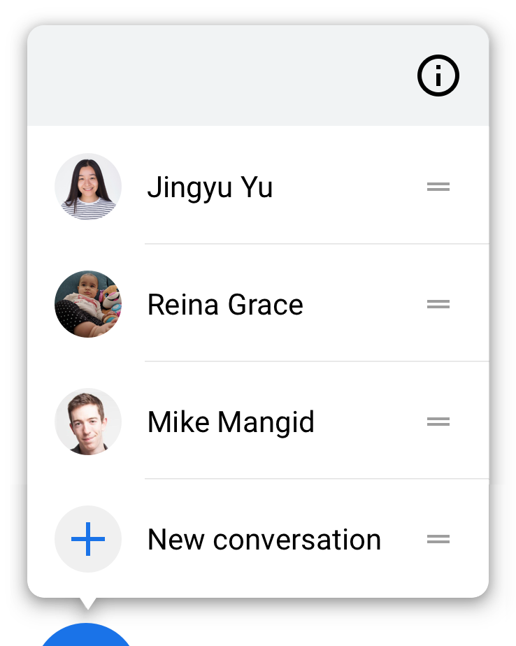
Surfaced potential, designed for the future, created APIs, shipped on many surfaces
- Surfaced person + app pair primitive importance in Sharesheet, recognized potential for leverage across the OS, seeded idea to Android UX and engineering teams
- Cemented importance of people primitives in the OS through internal advocacy and careful selection of developer requirements + communication.
- Designed and built towards a people-centric future, partnered and executed with Android Devrel to get app buy-in. As of 2022, most major chat app publish Sharing Shortcuts because of this work.
- Inspired and co-designed new direct share API to be person focused
- Persuaded team to test prototypes I built, leading to the integration of sharing into Recents / Overview, people into on-device search and became the inspiration for foundational copy/paste research
Validated what worked, pivoted the team, coordinated to ship
- Validated and invalidated several early core design aspects of the project by designing user studies with complex prototypes, coordinating across various teams (UX, Machine Learning, Messages, Launcher, Notifications, etc), leading the team to pivot to focus on people notifications
- Because of me, the People / VIP project was elevated enough to become a UX focus for the Android 11 with validated ideas that were technically feasible and was positioned for future growth.
Highlights
- Conversation & Shortcuts documentation: authored the majority of this content
- Conversation Shortcut I/O presentation, coordinated and created Sharing Shortcuts content
Sharesheet in Android Q
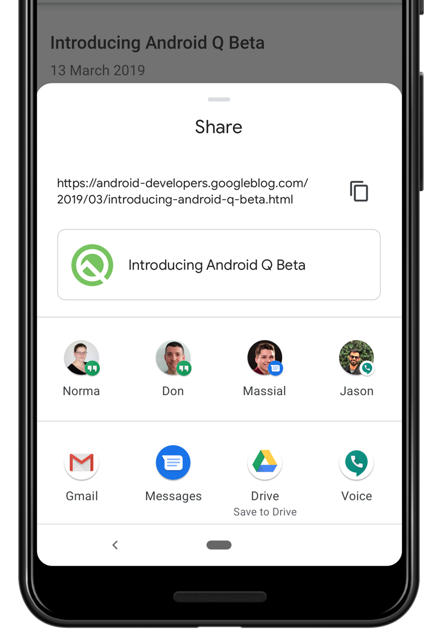
Coordinated efforts across 13 people, polishing final design and building UI
- Lead the final design polish through implementation. To build a user tested, red-line checked, prod-ready UI, I have coordinated efforts with 3 designers, 5 engineers, 4 researchers and and a PM.
- Led project through internal design reviews, aligning efforts with the design team. Created an IxD spec with necessary design nuance for final implementation.
- Worked with research to design and provide prototype support for 4 studies on usability and developer perspective
- Leveraged prototype leanings to advocate for technical direction on specific components.
Brought the new Sharesheet to launch in Android Q
- Implemented final polish details in Android source, found visual bugs and guided changes to reach for pixel perfection. My work includes:
- Icon loading logic with permissions cutout requiring API review [code], [code]
- Perceptual improvements to loading time via tweaking of entrance animation [code]
- Direct share loading animation changes I designed, layout updates [code]
- Identifying a low level SKIA rendering problem
- Custom manual testing app to validate machine-learning shortcut suggestions
Took point on developer outreach and documentation for Sharesheet
- Spoke at Google I/O about Android Q Sharesheet changes, designed slide content
- Completely rewrote Android sharing documentation to missing add clarity and detail
Highlights
- Google I/O presentation: I/O site and talk on Youtube
- Rewritten sharing documentation
Wifi QR code sharing in Android Q
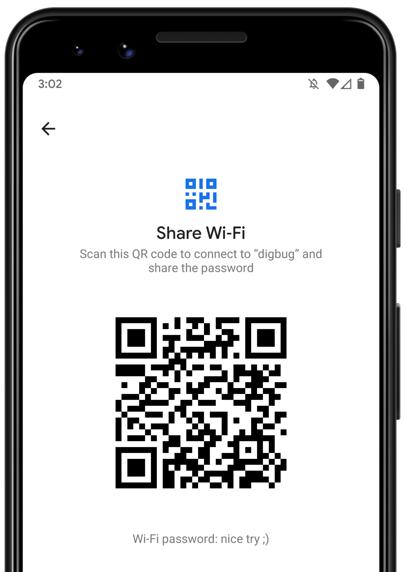
- Explored mechanisms to improve person-to-person wifi sharing. Work includes details on ecosystem support for code scanning and Settings app entry points, QR code scanner design.
- Seeded deck and prototypes on how to improve wifi sharing through the use of QR codes along with a mechanism to reveal wifi passwords to Android Settings team.
- Advocacy and persistence convinced the Settings team to implement and ship this for Q
- Consulted with the Setting team designers and engineers to bring idea to life; much of my original proposal was implemented as-is
- Launched with positive press by CNET and Android Police
Research+design of gestural navigation params in Android Q
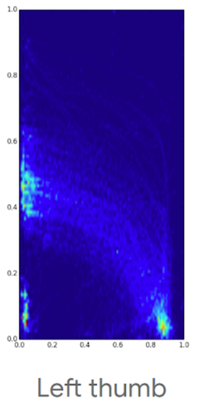
My signal processing and gesture design background led me to be deeply involved with the design of the touch gestures used by the new system gesture navigation introduced in Android Q.
- Built app to collect fine-grained touch event sequences from the screen edge, leveraging hack to move nav bar off-screen, logged data included MotionEvent details and display implied stats
- Worked with research to design and build gesture testing sequence into app, including between gesture-distractor tests. Tested on a large pool of participants.
- Aggregated and analyzed touch sequence data to support design ideas and derive heuristic parameters that create natural, data-based gestures. Gestures accommodated for:
- Left/right handedness
- Strain from continuous usage, reach
- Various phone form-factors
- User hand sizes and finger span, grip and positioning
- Gesture navigation launched in Android Q leveraging the collected stats, see the Android developer blog for more
Rotation Locked Mode in Android P
I identified the pain point, researched prior art, prototyped solutions, formed a team, owned the interaction+visual+motion design and final production code, brought the feature to launch in Android P.
Identified pain points, developed solutions, iterated on UX, sold the idea
- On my own initiative, researched prior work and pain points with auto-rotate on mobile platforms, proposed initial solution, shared summary deck with Android leadership
- Iterated on formfactor and interaction to make a feasible draft solution
- Built a functional, livable prototype with logging, shared internally to gather interest, users and stats
- Commissioned a study with the prototype to understand usage, iterated on results
I formed and advisory board + team, brought feature to greenlight
- Gathered interested parties to form an informal UX advisory and sounding board including many from Android UX leadership
- Got PM support and architecture + review support from System UI
- Pivoted on the design and supporting prototypes to find a better fit in Android ecosystem
- Proposed a complete solution to Android leadership which was a greenlighted design for P
Created design assets, built production code, launched in Android Pie
- Worked with designers to explore iconography and motion, I designed the final icon + motion assets
- Built, tested, and integrated final production code including complex changes to Window Manager logic and System UI (some associated AOSP commits: 1, 2, 3, 4)
- With PM, collaborated with several teams to launch, a few examples:
- Sensors team to resolve power issues
- Security and logs to turn on logging support
- Developer advocacy to lock down developer and partner communication, example
- Several Google apps teams to advise on rotation UX and aid with rotation bugs
- Launcher to fill the recents button in the navbar with contextual elements
Highlights
- Google I/O 2018 Android P rotation lock announcement
- Android Developers rotation feature details
- Arstechnia Android Pie review, best features
“The smart rotation button is awesome—there is finally a good, reliable, predictable way to manage phone orientation.”
- 9to5 Google’s Top 5 Android P features
“This last one is absolutely my favorite feature of Android P. A new contextually aware button can appear in the navigation bar to allow temporary rotation of the screen, even when rotation is locked. This is an incredibly handy feature that I’ve already been using a ton.”
- Android Police’s Android P: Our 5 favorite new features so far
“Prior to P, the display would stay in portrait regardless, so the only way you could see your photos or maps in landscape, for example, was to enable auto-rotate then remember to toggle it off when you were done. This change is tiny, but it’s certainly one we’ve fallen in love with.”
Ergonomic, media default volume in Android P
I identified pain points, developed early solutions, sold the need for change, iterated on the UX with the P volume working group, created robust take home prototypes, bridged complex design decisions across Audio System, Bluetooth, System UI and Chromecast, launched the changes in Android P.
Identified pain points, developed solutions, sold the need for change
- On my own initiative researched + audited platforms and code to come up with volume and Bluetooth audio pain points, shared summary deck to gather interest
- Reverse engineered a mechanism to proportionally mirror media volume level across all streams. Used this to build a liveable prototype, demonstrating the idea.
- Planted the seed for the need of volume improvements by sharing the above prototype and selling the idea person-to-person. This helped elevate volume UI and audio core interactions as a focus for Android P.
Iterated on the UX, created multiple robust prototypes
- Iterated with Android UX to design and explore visual and interaction changes.
- Created prototypes used in a study to evaluating volume proposed models quantitatively. Architected specialized logging of volume use with complex interactions like media playback and audio device dis/connection. As a testament to improved experience and prototype quality, many participants chose to continue using the prototype at the study’s end.
- Proposed, designed and prototyped many interactions, including the final ringer mode toggle, intro ripple and vol up + power gesture
- Proposed, fleshed out initial eng/design details, provided guidance on multi-device interaction and Chromecast integration. Helped drive decisions on complex issues.
Android P Sandbox Google I/O ‘18 Lead
I created the final display content, designed demos + built an associated notification demo app (picture below), setup the exhibit, trained others on materials and lead the press walkthrough for the Android P System UI Sandbox at Google I/O 2018.
Highlights
- Android P Sandbox with me in PCWorld’s Android P Beta in-depth: Best new features
- Android P Sandbox with recorded demos from me in Engadget’s Android P Hands-on
Fast Pair
Easy headphone pairing via BLE and Nearby
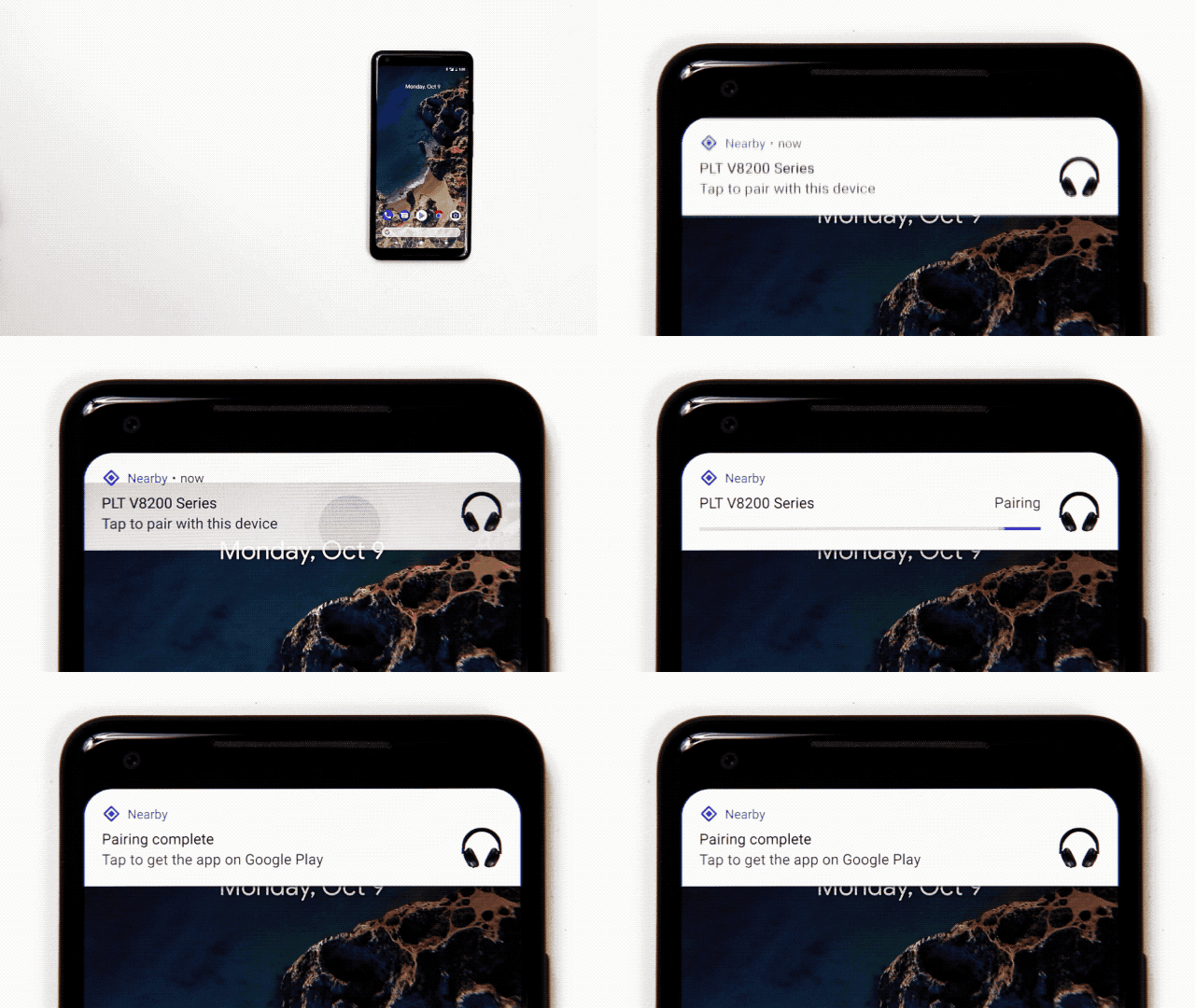
Apple removed the 3.5mm headphone jack in the iPhone 7, setting the precedent for Android OEMs to follow. Mobile use of headphones and speakers of all forms one day may be wireless only. Today’s pairing process, however, is painful. I explored how to make pairing better in Android and bootstrapped a project across Nearby and Android Bluetooth to bring these changes to life.
Identified pain point, validated need, developed solutions
- On my own initiative researched + audited Bluetooth pairing across platforms
- Ran desktop study to observe pain points in the pairing process
- Built a functional prototype to demonstrate a first pass at better pairing UX. Demo used an Estimote with a custom Eddystone broadcast. On Android, BLE ad detection is then used to bootstrap an A2DP Bluetooth classic connection where the pairing acceptance dialog is suppressed (by aborting an ordered system intent). Distance between devices is ensured by using low ad TX power.
- Built a robust prototype by electrically modifying headphones to power an nRF51 BLE advertising dongle. Wrote firmware for the nRF51 that implemented the proposed technical solutions. Created and shared a demo video reel.
Iterated on the UX, created multiple robust prototypes, fleshed out spec, launched
- Fleshed out and iterated on interactions, targeting the major problems along with the corresponding technical requirements.
- Worked with Bluetooth and Nearby to flesh out a future-proof manufacturer specification based on future features and OEM feedback.
- Demoed prototypes at two major internal events.
- Owned the vision, research, interaction, visual and initial technical design proposals. Got interaction greenlight from Android UX.
- Designed and validated BLE signal normalization techniques across devices.
- Teamed up with Nearby team to put this in the upcoming release of Google Play Services to coincide with the Android Oreo release.
Highlights
- Android Developers Blog announcing Fast Pair
- 9to5 Google Review of Libratone Q with Fast Pair
The main reason Pixel owners should be considering these headphones is for one feature and one feature alone — Fast Pair.
- Arstechnica Pixel 2 review with notes on Fast Pair
Setup is super easy. You turn on the headphones, the phone immediately pops up a notification saying it detected the headphones, and you hit “pair.” Easy!
- Business Insider Fast Pair article
Better than Apple’s version in one crucial way… It’s a lot easier for headphone makers to adopt Google’s Fast Pair than it is to build new headphone models with Apple’s W1 chip.
Dismiss on capacitive, resistive, rotary headunits
Built 50+ prototypes to bring home card dismiss to Android Auto Projected, across its various input methods: capacitive touch, resistive touch and rotary. Prototypes explored interaction, visual and motion options. Ran a study and iterated with feedback to get buy-in from stakeholders in UX, PM and Eng on interaction basics. Once roadmapped, gave feedback to UX team during IxD and VisD iterations. Aided with bug fixes in final implementation.
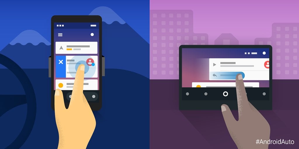
A few insights I developed through prototying that guided the final implementation:
- Long press is the best available trigger to start dismiss with rotary and resistive touch
- Don’t provide an undo mechanism, no secondary signals; too complex while driving
- To improve dismiss discoverability on rotary and resistive, use vivid motion to enter dismiss mode and distinct aesthetics to differentiate it
- Motion to expose dismiss mode should not translate the card, resistive users will find it moving under their finger
- Avoid zig-zag rotary highlight pattern when possible to a better first experience, however users will figure out the pattern after a few uses
Highlights
- Android Police report on dismissing cards in Android Auto
There’s a new version of Android Auto rolling out and this one is definitely worth the download. Version 2.2 brings one of the most requested features to the Auto interface since it was launched: Notifications can now be swiped away from the overview screen.
Patents and Publications
- "Stress Testing Gestures for Smartphone System Navigation", MobileHCI '24, Sep 2024
- "Device Name Personalization Using Generative Artificial Intelligence", DPUB6502, Dec 2023
- "Intelligent user interface rotation", WO2023239409A1, Dec 2023
- "Sharing of captured content", WO2023196166A1, Oct 2023
- "Hybrid scrolling of user interfaces", US20190065021A1, Feb 2019
- "Dismissing displayed elements", US20180275863A1, Sep 2018