TEDxCornell [FALL 2011]
Lead Designer, Front End and PHP Engineer
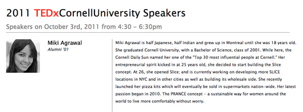
Website Layout Snippet

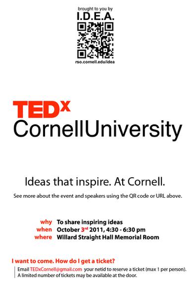
Poster Design

Overview
As a member of the TEDxCornellUniversity steering committee, I took on the responsibility of establishing and maintaining advertising, branding and media. This was done through a series of productions including the TEDxCornellUniversity website, pamphlets for attendees of the TEDx event, posters to advertise around campus and one large banner to mark the event’s location.
Design Considerations
- Prior to event: website served as a launch board during the initial advertising campaign to distribute key event details and information on speakers
- After event: website served as a place to view information on the speakers, watch videos of the talks, find details of the next year’s event, and gather information on the organizing body
- The design should incorporate key elements of the official TED website
- The layout should allow visitors to quickly find event details to avoid a high bounce rate and low visit duration
Goals
- Develop the site and launch it within one week
- Give visitors all the information they need to know in a concise manner
- Provide the option for visitors to view more detailed information if they choose
- Enable extensibility of the site to hold post-event details without much layout modification
Solutions
- Borrow the design of TEDxUofM and modify it to complete the style and layout development quickly
- Place only need-to-know information (including that which is required by TED licenses) on the index
- Provide more information on speakers on a separate page
Event Pamphlet Design
Design Considerations
- Would be given to all attendees of TEDxCornellUniversity at the time of the event
- Ability to be easily mass produced
- Needed to contain information on each speaker
- Include a clear note about the networking event to follow the talks
- Integrate a link to the website into layout
Goals
- Give attendees all the details on each speaker so they may do research at home
- Provide an event timeline, detailing the approximate order of events to occur
- Be easy and cheap to make in bulk, using standard printing techniques
- Give space for attendees to take notes
Solutions
- Reuse the website design for speakers layout
- Print on one side of standard 8.5 by 11 paper using laser color printers available on campus
- Use color to differentiate the timeline from the speaker’s bios
- Follow the TED color scheme
Poster Design
Design Considerations
- The poster would be displayed alongside other posters of similar form factor, likely on top of other posters
- View attention for bulletin boards is limited, and only the newest and most unique content is focused on
Goals
- Grab the attention of students despite competing advertisements
- Enhance the visibility of the poster by making it stand out
- Placate sponsors by displaying their logos
Solutions
- Use large white spaces in combination with a large version of the well-recognized TED logo to attract attention
- Print in a non-standard size, chosen to be 11 by 18, to help stand out from other posters